

Wondering what color to paint interior trim? The right trim color can completely transform your home’s look and feel. From classic whites to bold blacks and everything in between, the possibilities are endless.
In this guide, we’ll explore how the perfect trim can elevate your space and reflect your unique style.
Interior trim is the secret hero of interior design. It’s the final detail that can take a room from ordinary to extraordinary.
Often underestimated, the color and finish of your trim can dramatically change the entire look and feel of your space. While white trim is timeless, there are countless other options to consider.

This guide explores everything from bold contrasts to subtle tone shifts in trim colors and finishes. You’ll find expert advice to help you pick the perfect trim to match your wall color, highlight your home’s architectural features, and create a personalized space that reflects your style.
CHECK OUT THIS HELPFUL VIDEO:
What Color to Paint Interior Trim
Choosing the right trim paint color can be a game-changer, subtly shaping the mood and highlighting the architecture of your space. Whether you opt for a classic white, a bold contrast, or something in between, the options are endless.
Discover the transformative power of trim color and find the perfect hue to elevate your home’s style.
Trim Color Trends: Beyond Basic White
In this guide, we’ll explore:
- the warmth of monochromatic tones
- the drama of black and moody darks
- the natural beauty of stained wood
- and the elegance of whites
We’ll also dive into high-contrast options, subtle shifts in tone, and the seamless look of matching paint and trim.
Monochromatic: A Calming Retreat
This is my go-to when I want a space to feel calming and inviting. Painting the walls, trim, and even the ceiling all the same color has a cocooning effect.
The first time I felt this was when I painted my theater room all the same color. I went with Black Magic by Benjamin Moore and was instantly in love.
As I was painting the ceiling I could feel that enveloping effect. It was crazy to be able to actually feel the change taking place in that room.
Any dark, moody color will work when striving to accomplish that monochromatic (also called color-drenched) look.

I love the look of a dark moody green like Laurel Woods by Sherwin Williams. You can see the beauty of this color in my home office/guest room remodel.
For more monochromatic paint color ideas, be sure to check out my dark and moody color tones article.
Don’t be afraid to go dark. A monochromatic color palette is a great way to make a room feel larger, but at the same time cozy.
White: A Timeless Classic
White trim is a versatile choice, offering a clean, bright backdrop for any style. But not all whites are created equal. Subtle undertones – warm, cool, or neutral – can dramatically affect the mood of your space.
Consider your room’s natural light and the desired atmosphere when selecting your shade.
For a truly pure white that complements any color scheme, Behr Marquee Ultra Pure White in a semi-gloss or satin finish is a fail-safe option. Other top contenders that lean towards a clean, bright white include:
Note: Sherwin Williams Pure White is more of an off-white color, but still a beautiful light color tone.
My entire first-floor interior trim is painted Ultra Pure White by Behr Marquee. I chose to use a semi-gloss paint sheen. It gives a nice, subtle contrast between the walls and the trim.

Taupe/Creamy White: A Touch of Warmth
For a softer, more inviting alternative to pure white, consider the gentle embrace of taupe or creamy white trim. These off-white hues add depth and warmth.
They create a clean and cozy atmosphere that complements a variety of wall colors, particularly those with warm undertones. It’s a subtle shift that makes a big difference, adding a touch of elegance and sophistication to any space.
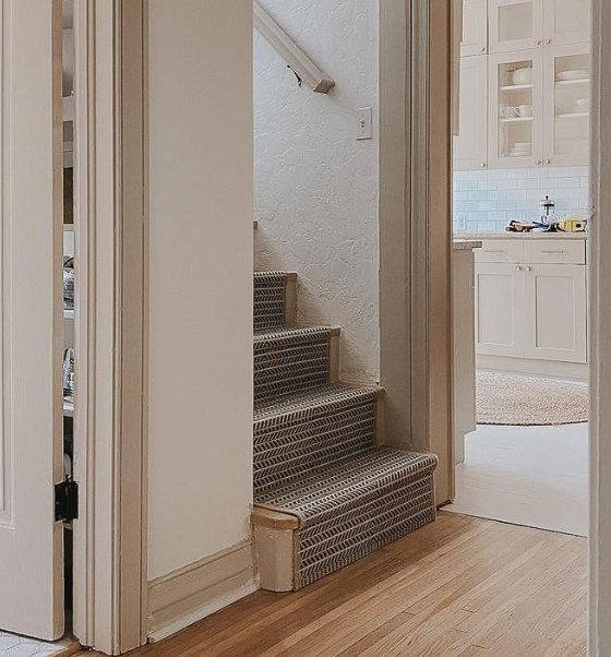
Image Credit: @florencerevival
Black: Bold and Dramatic
Black trim is a bold choice, but it can create a sophisticated and dramatic look in your home. It’s a statement maker that’s perfect for modern interiors and spaces with lots of natural light.
Black trim works well with any shade of white or light-colored walls, adding depth and definition to your space.
It can even make a room feel larger by visually receding and drawing the eye to architectural details. If you’re worried about a stark contrast, consider using a softer black with a hint of brown or blue for a more nuanced look.
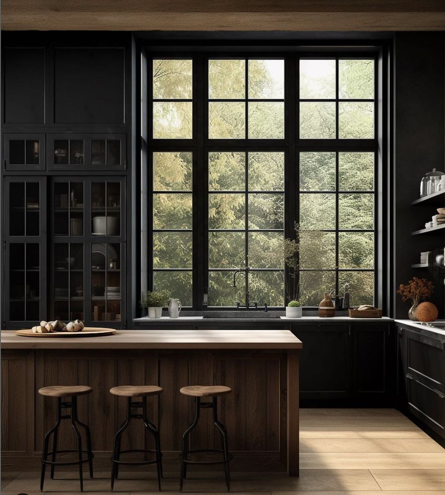
Image Credit: @ann_marie_co
Moody Darks: Rich and Dramatic
Dark color paint isn’t just for walls. Deep blues, forest greens, charcoal grays, and even black can create a rich, dramatic look for your trim.
These moody hues add depth and dimension to any space. Especially larger rooms with plenty of natural light. They’re perfect for highlighting interesting architectural details like crown molding or paneling.
Against crisp white walls, dark trim creates a striking contrast that’s both modern and timeless.

Image Credit: @ann_marie_co
High-Contrast Trim: A Bold Statement
High-contrast trim is all about the power of opposites. Think light walls with dark trim, or dark walls with light trim. This bold color choice creates a visually striking and dynamic effect, adding depth and interest to your space.
For a high-contrast look that pops, pair crisp white or light-colored walls with a bold trim color like black, charcoal gray, or even a deep jewel tone.
This dramatic juxtaposition draws the eye to architectural details like crown molding and door frames, creating a sense of depth and dimension.
If you’re feeling adventurous, you can even reverse the scheme with dark walls and light trim, achieving a sophisticated, moody atmosphere.
To maximize the impact of high-contrast trim, consider using complementary or contrasting colors on the color wheel.
For example, a deep blue trim pairs beautifully with crisp white walls, while a moody green trim adds a touch of nature to a warm neutral space.

Slightly Darker Trim: Subtle Sophistication
A slightly darker trim color than your walls offers a sophisticated touch without being overly dramatic. This understated contrast works beautifully with neutral or muted wall colors like soft grays, beiges, or muted blues.
It adds depth and dimension to the space while maintaining a calm and inviting atmosphere. If high contrast feels too bold, slightly darker trim is a perfect compromise.
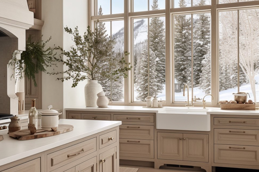
Image Credit: @ann_marie_co
This popular approach complements a wide range of interior styles, from modern farmhouse to traditional. It’s a subtle way to elevate your space and create a cohesive look.
For a truly harmonious feel, consider choosing a trim color that’s two to three shades darker than your wall color within the same color family. This will ensure a seamless transition that’s both elegant and visually appealing.
Matching Trim & Walls: Seamless Style
Painting your trim the same color as your walls creates a seamless, contemporary look. This minimalist approach emphasizes clean lines and architectural details without any visual interruptions.
To avoid a flat, one-dimensional feel, use a glossier sheen on the trim. This subtle difference in finish adds just enough contrast to define the trim while maintaining a sleek, unified look.
Stained Wood Trim: Natural Beauty
Stained wood trim brings warmth and character to any space. The natural wood tones create a unique look that can complement a variety of design styles.
Whether you prefer light wood stains for an airy, coastal feel or rich, dark stains for a more traditional ambiance, there’s an option to suit your taste. Choose a stain that complements your wall color and overall style, allowing the wood’s inherent beauty to take center stage.

I chose a warm wood stain for my master bedroom’s large picture window frame. I love the unexpectedness of this added touch. Completely different from the rest of the trim in the room, this simple move makes this window stand out.
Window frames are a great interior trim to stain rather than paint. It’s sure to make a statement every time.
How to Paint Trim: A Step-by-Step Guide
Ready to refresh your trim? With the right tools and techniques, you can achieve a flawless, professional finish.
Prep Work: Start by cleaning your trim with a damp cloth to remove any dust or grime. If your trim has any imperfections, fill them with wood filler and sand smooth. Protect your walls and floors with painter’s tape and drop cloths.
Prime Time: Apply a coat of primer to help the paint adhere and ensure even coverage. Allow the primer to dry completely before moving on to the next step.
Paint Application: Choose an angled brush designed for trim work. Dip the brush about halfway into your paint and tap off any excess. Start by “cutting in” – painting the edges of the trim where it meets the wall or ceiling. Then, use smooth, even strokes to paint the rest of the trim. Apply two coats for a professional finish, allowing each coat to dry thoroughly.
Finishing Touches: Once the paint is dry, carefully remove the painter’s tape. If you notice any drips or uneven areas, lightly sand them and touch up with paint.

Pro Tip: Visit your local paint store to gather paint chips and sample different colors. Keep in mind the latest paint trends for inspiration, but ultimately, choose a color that complements your personal style and the overall feel of your home.
Characteristics of Low Contrast/No Contrast Trim
- Serene Atmosphere: Creates a calm, peaceful ambiance.
- Visually Expansive: Makes rooms feel larger and more open.
- Clean Lines: Emphasizes architectural details without visual interruption.
- Modern Aesthetic: Aligns with minimalist and contemporary design styles.
- Soft Transitions: Blends walls and trim for a seamless flow.
- Brightens Spaces: Especially effective in rooms with limited natural light.
- Ideal for Small Rooms: Prevents visual clutter and maximizes perceived space.
- Versatile: Complements a wide range of color palettes.
- Timeless Appeal: A classic choice that won’t go out of style.
- Easy to Decorate Around: Offers flexibility in furniture and decor choices.

Image Credit: @ann_marie_co
Characteristics of High Contrast/Dark Trim
- Dramatic Impact: Creates a visually striking and eye-catching focal point.
- Defines Architecture: Emphasizes moldings, door frames, and other details.
- Adds Depth: Creates dimension and visual interest in a space.
- Modern or Traditional: Works well with both contemporary and classic styles.
- Versatile: Complements a wide range of wall colors, particularly lighter shades.
- Elevates Neutrals: Adds personality to spaces with muted color palettes.
- Creates a Focal Point: Draws attention to specific architectural elements.
- Maximizes Natural Light: Works best in well-lit rooms.
- Bold Statement: Conveys confidence and a sense of style.
- Visually Exciting: Offers a unique and unexpected alternative to traditional

Image Credit: @ann_marie_co
As we’ve explored, the options for trim colors are as varied as your own personal style. Whether you gravitate toward:
- the timeless elegance of white paint colors
- the dramatic allure of dark hues
- or the subtle sophistication of slightly darker trim
There’s a perfect choice for every home. Don’t be afraid to experiment and embrace the transformative power of trim.
Remember, interior trim is more than just a finishing touch. It’s an opportunity to express your individuality, elevate your space, achieve a modern look, and create a home that truly reflects your unique style.
So go ahead, explore the possibilities, and discover the perfect trim color combination that will make your house a home.
Designer Tip: When It Might Be Time to Bring in Help
If you’re working on your home and things still don’t feel quite right, you’re not alone. Many of our clients start exactly where you are now. They’ve gathered ideas, saved inspiration photos, and maybe even purchased a few pieces, but the space still doesn’t feel cohesive. That’s often the moment when having a designer can make all the difference. We help homeowners create a clear plan so every decision works together. From layout and furniture placement to finishes and lighting, the goal is a space that feels thoughtful, comfortable, and complete.
If you’d like a little guidance with your space, you can learn more about our interior design services below.
Explore Interior Design Services
Planning a kitchen, living room, or full home project? Start with a quick discovery call to see if we’re a good fit.
Let’s go beyond the design to build something beautiful together!
Until next week,
Happy Designing, Friend!!
Don’t forget to join my VIP List below for many more great tutorials.
Hop over to Instagram to see all of the D2B behind the scenes. What am I working on now?….come check it out!
More Great D2B Painting Tips Posts:
9 Top Kitchen Paint Colors in 2024 for Walls and Cabinets
The Best Dark and Moody Paint Colors for Your Home in 2024
Step by Step Guide to Painting Eaves for Instant Curb Appeal

0 Comments