

A question I get asked about often are the paint colors in my home. To make things easy, I thought I would break down each room and share all of the colors I’ve used throughout my home.
From the primary wall color, to the accent colors, to the sheen I’ve chosen for all of my trim, this post will cover it all.

Organic Modern Paint Colors: My Home
Colors in a home tell you a lot about the type of style a person likes. For me, my home leans towards a blend of Scandinavian and Organic Modern style. But what exactly does that mean?
My Style: Organic Modern Meets Scandinavian
It means my style is all about
- clean lines
- organic materials
- natural elements
- earthy colors
- minimalism
- and a sense of warmth that makes each space feel both sleek and inviting.

Scandinavian design brings in the light, airy feel with neutral tones like my go-to white paint color–Behr White Moderne.
Organic Modern focuses on natural textures and bold, earthy accents. Like the deep green of Sherwin Williams Laurel Woods and the striking Tricorn Black.
Together, these styles create a balance of simplicity and comfort. They add a touch of drama that feels effortlessly modern yet grounded.
My Organic Modern Color Palette

My “Main Floor” Paint Colors
The first floor of my home is a very open and airy space.
Open Concept Space-Primary Wall Color
My kitchen, living room, dining room and entryway all flow together. It was important to me for all of these spaces to feel intentional and cohesive, rather than disjointed.
That’s why I chose Behr White Moderne as the primary color. It creates a bright, seamless backdrop that unifies the entire first floor. The soft white color tone allows each area to stand out while still feeling connected. It provides a calm and clean canvas for the furniture and decor to pop. They become the star of the show.
As a result, this space feels thoughtfully designed. Every element works together to create a harmonious flow from one room to the next.
When it comes to open-concept living, finding a color that can tie the space together is key.
Open Concept Space-Accent Wall Color
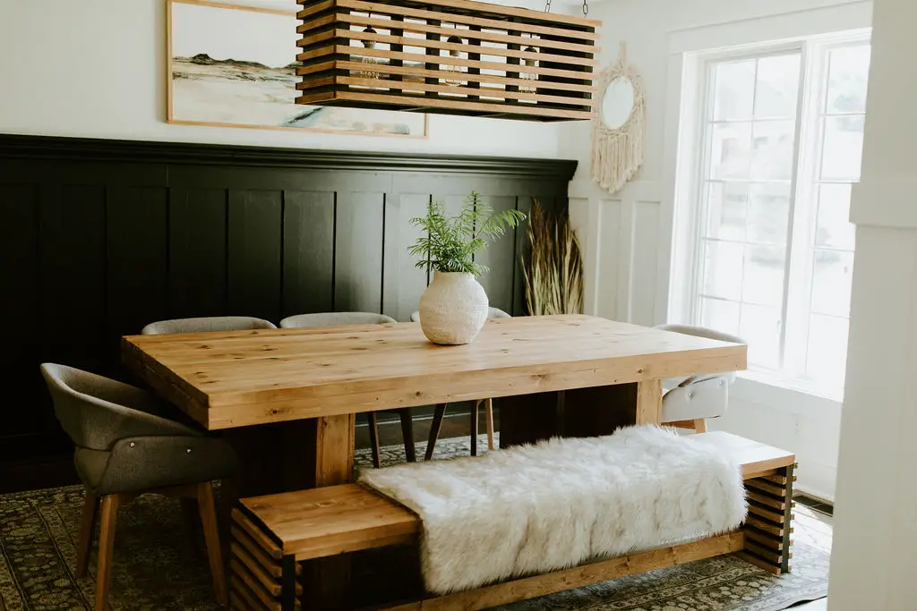
But all-white walls can become boring real fast. To add visual interest and an element of surprise, I incorporated bold black accent walls. These walls bring depth and contrast to the space.
In my family room, I added a striking black board and batten wall that gives the room a modern, sophisticated feel. This design choice is mirrored in my dining room, where another black accent wall creates continuity between the spaces.
Although the two walls are separated by a hallway, the use of the same bold color ties the rooms together seamlessly, making the open concept feel more cohesive.

One of the most impactful features is my black fireplace wall in the living room. With 12-foot ceilings, the tall fireplace becomes a stunning focal point, drawing the eye upward and adding a dramatic touch to the space.

These black elements add character without feeling trendy. They ensure that each space feels fresh and stylish for years to come.
Couple the soaring fireplace with the adjoining wall of floor to ceiling large windows and you have a room with tons of natural light. The crisp white walls, earthy tones and black highlights create an organic modern design style that flows well with the organic feel of my home.

Master Suite – A Perfect Balance of Softness and Boldness
Our master bedroom is located right off of our living room. For the longest time, I would just close the door to this room, as it was nothing pretty to look at.
When I finally made this room a priority, I knew I wanted it to feel like a retreat. Somewhere my husband and I would look forward to hanging out in the evening.
I’m all about neutral wall colors, so I continued my go-to white paint color-Behr White Moderne-into this space. All of the walls in my master bedroom and bathroom are this warm white color.
I brought in more warmth and contrast by adding a wooden accent wall. I chose Sherwin Williams Shade Grown for this simple geometric wall feature. This moody green hue adds the perfect pop of color.
There was one element of our bedroom that I did not care for at all. When our home was built back in 2003, many builders were adding tray ceilings to the primary bedroom. Our home was one of these not so lucky ones to have this added.
Today this feature can date a home very quickly.

When deciding to renovate our bedroom, I wanted nothing more than to draw the eye away from the ceiling. My goal: don’t make the ceiling pop. Kinda funny how now the ceiling IS the focal point of the room! And the feature I disliked the most, is now my favorite!
Adding Sherwin Williams Tricorn Black wooden slats and lightly stained wooden beams draws the eye to this beautiful ceiling. In the end, it wasn’t that I needed to get rid of this dated feature, I just needed to make it something appealing for the eye to see.
I carried this black wooden slat feature into the master bathroom too. Running carsiding vertically up the wall of the vanity and across the span of the ceiling really brings the WOW factor to this room.
My “Upstairs” Paint Colors
Moving on upstairs to the upper level of our home. Once again, most of this floor is Behr White Moderne. However, there is one room that stands out and truly makes a statement.
My Home Office/Guest Room-Cozy Green
My home office/guest room is where I spend most of my time throughout the day. And thankfully, it has become my favorite room of my home. What used to be a catch all room with blah tan walls, is now a cozy, moody green office space that I love to hang out in.
My goal for this room was to make it an inviting and warm space. Painting the walls AND the ceiling all the same color was the key to achieving this goal.
I color drenched this room with Sherwin Williams Laurel Woods. The perfect color for this south-facing room, that the sun pours into.

My “Lower Level” Paint Colors
Now let’s head downstairs to my family’s favorite room in our house.
Our Theater Room
Of all the rooms in our home, this one went through the biggest transformation. For several years it was my oldest 2 sons bedroom that they shared together. A huge room that they decked out in Ohio State colors and paraphernalia.
All of my boys are huge Ohio State fans and absolutely loved this room. Remember this was a teenage boys’ room. Not exactly the picture of clean. :(

When my older boys were all grown up and moved out, I announced that I was going to turn this room into a theater room. The kids all loved this idea, until I said I would be painting the walls. Needless to say, I got a lot of protests on that decision.
But now that the room is finished, it’s the room everyone wants to be in.
Another room that I color drenched. I painted the walls, ceiling and all of the trim a dark moody color by Benjamin Moore called Black Magic. Perfect for a theater room!

My Go-To Sheen for All of My Walls
After sharing all of my wall colors throughout my home, I realized I didn’t share the sheen I like to choose.
But first of all what is Sheen?
- Sheen refers to the level of shine or glossiness in paint. It affects how light reflects off the surface, ranging from flat (no shine) to high gloss (very shiny).
One sheen to the next can change the overall look and feel of a room. Therefore, choosing the right sheen is important.
My go-to sheen for all of my walls is satin. Satin doesn’t have the high shine of gloss, but it still reflects just enough light to give the walls a soft, smooth finish.
It’s durable and easy to clean, making it perfect for busy areas like the living room and kitchen, without feeling too shiny or distracting.
Finishes Touch – My Trim Paint Color
My go-to paint color for all of my white trim is Behr Marquee Ultra Pure White in a Semi-Gloss sheen. I like to keep my trim color in the same color family as my wall color. However, changing up the sheen on the trim adds dimension, in spite of the colors being very similar.
When I color drench a room, I will choose the same color as my walls for the trim. And unlike my white walls, I’ll also keep the sheen the same too.

Don’t be afraid to play with paint! It’s one of the simplest and most affordable ways to completely change the look and feel of a room. Whether you go for warm neutrals or bold, moody earth tones, the beauty of paint is its versatility.
If you find you don’t love it, it’s easy to start fresh with a new color. So take a chance—experiment with different shades and styles. Your home is your canvas, and a little paint can go a long way in making it truly yours.
Designer Tip: When It Might Be Time to Bring in Help
If you’re working on your home and things still don’t feel quite right, you’re not alone. Many of our clients start exactly where you are now. They’ve gathered ideas, saved inspiration photos, and maybe even purchased a few pieces, but the space still doesn’t feel cohesive. That’s often the moment when having a designer can make all the difference. We help homeowners create a clear plan so every decision works together. From layout and furniture placement to finishes and lighting, the goal is a space that feels thoughtful, comfortable, and complete.
If you’d like a little guidance with your space, you can learn more about our interior design services below.
Explore Interior Design Services
Planning a kitchen, living room, or full home project? Start with a quick discovery call to see if we’re a good fit.
Let’s go beyond the design to build something beautiful together!
More Paint Color Tips:
The Best Dark and Moody Paint Colors for Your Home
Front Porch Painted Black: Easy DIY for a More Modern Look
How to Paint Your Eaves and Gutters Black for Instant Curb Appeal

0 Comments