

Every year, I love curating a color palette that sets the tone for my design vision. For 2025, I’ve put together a selection of 7 stunning shades. These beautiful colors create a warm, inviting, and sophisticated home. If you’re looking for the best home color palette, this carefully chosen mix of hues will help you achieve a cohesive and stylish space.
But here’s the thing—this palette isn’t just about paint colors. These shades can be incorporated through:
- accent furniture
- decor
- textiles
- and even cabinetry

And if you know me, you know my one non-negotiable design rule—every room must have a touch of green. Whether it’s through faux or real plants, accent furniture, or decor, green adds life to a space and keeps it from feeling flat.
CHECK OUT MY LIST OF THE EASIEST PLANTS TO KEEP ALIVE
I believe that great design should be effortless and not overwhelming. That’s why I provide my clients with a carefully curated color palette in all my interior design plans. A cheat sheet for creating a cohesive and stylish home.
When you’re out shopping and find something you love, simply check if it fits within this palette. If it does, it will seamlessly work in your space. If it doesn’t, it’s probably not the right choice. My goal here, is to help you make confident, stress-free design decisions.
This palette is more than just a set of paint colors—it’s a roadmap to a well-balanced, thoughtfully designed space. Think of it as your secret weapon for making confident design choices. Whether you’re selecting furniture, decor, or finishes, let this be your guide.
Would you like your own customized color palette to make design choices easier?
Let’s work together to come up with a visual plan.
So, let’s dive in!
The Only Color Palette You Need In 2025
These are the colors I’m loving for 2025—versatile, stylish, and perfect for creating a home that feels both intentional and inviting.
1. Benjamin Moore Clay – The Elevated Neutral
This warm, earthy hue is a sophisticated upgrade from beige. Offering depth without feeling heavy. It’s ideal for creating a cozy, inviting atmosphere while keeping your space feeling fresh.
Here’s how to use it:
- On walls for a rich backdrop
- On kitchen cabinets for a grounded neutral
- In decor like throw pillows and rugs for a touch of warmth
If your space has a lot of natural light, Clay by Benjamin Moore, will feel soft and refined. And in lower light, it takes on a moodier, more intimate vibe.
Best Paired With: Swiss Coffee, Dusty Rosewood, and warm wood tones.

2. Sherwin Williams Laurel Woods – The Nature-Inspired Green
This deep, rich green brings a natural, grounding element to any space. It’s an excellent choice for…
- accent walls
- built-in shelving
- or kitchen cabinets
Adding sophistication without feeling overwhelming. If you’re aiming for a warm and cozy atmosphere, pair Laurel Woods by Sherwin Williams with neutral tones like Accessible Beige and Swiss Coffee.
This color works beautifully in traditional, modern, rustic, and organic modern interiors. Making it a versatile choice for those who want to embrace deep, nature-inspired tones.
Best Paired With: Warm neutrals like Accessible Beige and Swiss Coffee.

3. Sherwin Williams Accessible Beige – The Perfect Greige
This warm greige is the ideal backdrop for any space, balancing warmth and neutrality. It works well in living rooms, bedrooms, and kitchens. Creating a soft, welcoming environment without feeling too warm or too cool.
Use it on walls for a timeless foundation, pair it with bold accents like Cracked Pepper for contrast. Or layer it with wood finishes for added texture.
Whether you’re styling a modern, classic, or traditional home, Accessible Beige offers versatility that keeps your space feeling fresh and cohesive.
Best Paired With: Dusty Rosewood, Cracked Pepper, and soft wood finishes.
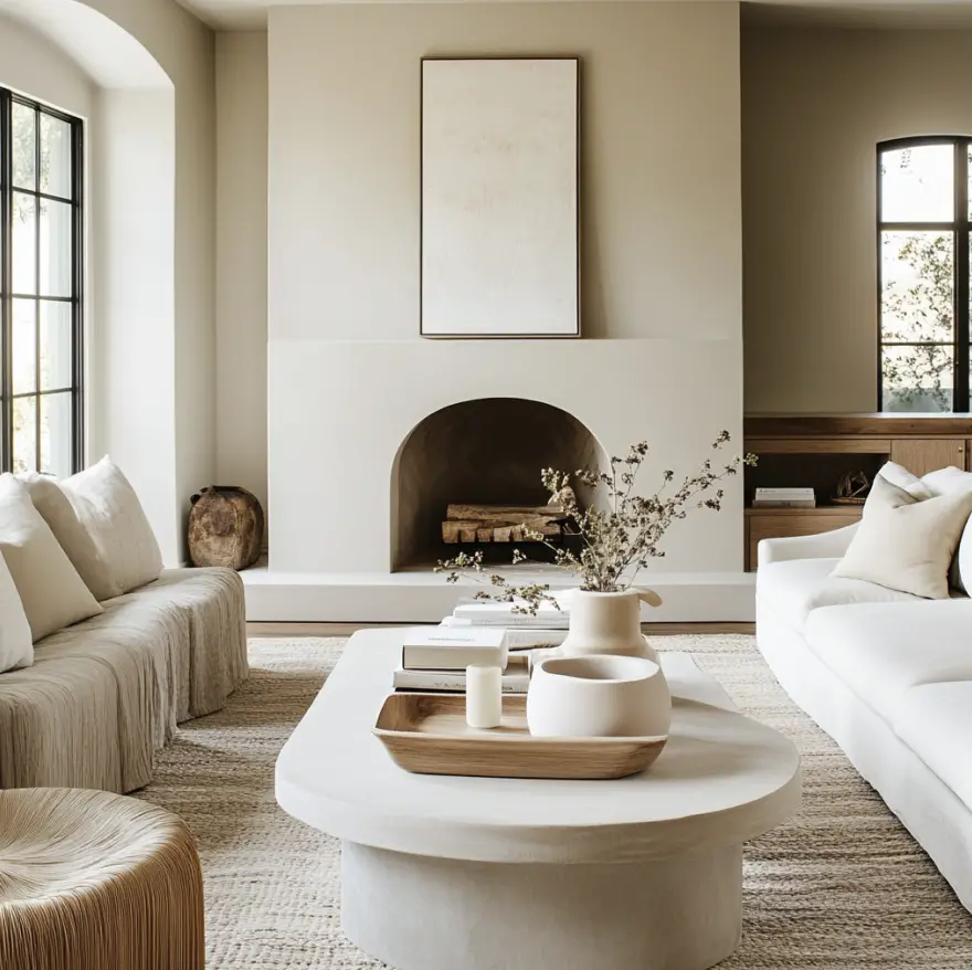
4. Benjamin Moore Swiss Coffee – The Classic Warm White
A soft, warm white that feels inviting without looking too yellow or too cool. Working well in both modern and traditional spaces, Swiss Coffee is a great choice for those who want a timeless white
Tips for how to use it:
- On walls for a subtle warmth
- On trim to create contrast
- Or on cabinetry for a clean and classic look.
A versatile addition to any home, it pairs effortlessly with both bold and neutral shades.
Best Paired With: Any of the colors in this palette!

5. Behr Dusty Rosewood – The Soft & Sophisticated Touch
This muted, dusty rose is a versatile accent color that adds warmth without feeling overly feminine. Use it on upholstered chairs, throw pillows, or bedding to introduce a soft, inviting feel.
It works well as an accent wall color in bedrooms or powder rooms, offering a hint of color without overwhelming the space. Or, if you’re feeling bold, this is the perfect color to color drench a small guest bath.
Pair it with warm neutrals like Accessible Beige for a balanced look. Or with soft metallics like brass and gold to enhance its elegant undertones. If you want to add depth, consider layering it with darker hues like Cracked Pepper for contrast.
Best Paired With: Clay, Accessible Beige, and soft metallics.

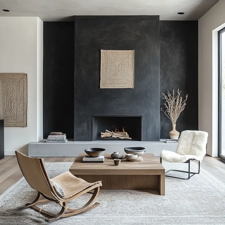
6. Behr Cracked Pepper – The Modern Neutral
This deep charcoal gray is a bold yet versatile neutral that grounds a space and adds depth.
Tips for how to use Cracked Pepper:
- On an accent wall for depth
- kitchen island for a sleek modern touch
- cabinetry to create a sophisticated contrast
- Or color drench an entire room in this color for a dramatic effect.
It’s also an excellent choice for doors and built-in shelving, making a statement without overpowering the room. Pair it with lighter neutrals like Swiss Coffee for balance. Or layer it with Dusty Rosewood for warmth.
If you want a refined and modern look, Cracked Pepper delivers a bold, polished aesthetic.
Best Paired With: Swiss Coffee, Accessible Beige, and Dusty Rosewood.
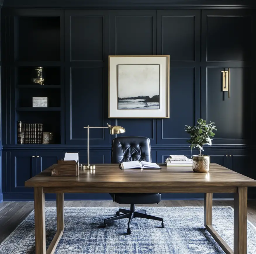
7. Sherwin Williams Moscow Midnight – The Bold Statement
This deep, moody navy is perfect for adding sophistication and depth to any space. Use it for color-drenching in a study or bedroom to create an intimate, cozy atmosphere. Or as an accent wall in a living or dining area for a bold contrast.
OK, NOW I WANT TO KNOW…WHAT IS COLOR DRENCHING??
It pairs well with warm neutrals and natural wood tones, making it ideal for modern, classic, and even industrial spaces.
If you want to make a statement without overwhelming the space, Moscow Midnight is a refined yet daring choice.
Best Paired With: Swiss Coffee, Clay, and warm wood tones.
My Go-To White Paint Color
While this palette includes seven versatile shades, I also want to highlight my go-to white paint color—Behr White Moderne. This is the white I have throughout my main floor because it’s warm yet true white, without gray or yellow undertones.
It’s a perfect backdrop for any space and pairs beautifully with every color in this palette. Whether you’re looking for a fresh, airy feel or a neutral base to let the other colors be the star of the show, Behr White Moderne is always a great choice.

The beauty of this 2025 color palette is its flexibility. Each shade complements the others, making it easy to create a cohesive home. Whether you’re looking to update your space with neutral paint colors, deep accent hues, or versatile decor, this timeless palette offers the perfect guide.
What’s your favorite shade from this year’s palette? Let me know in the comments!
Designer Tip: When It Might Be Time to Bring in Help
If you’re working on your home and things still don’t feel quite right, you’re not alone. Many of our clients start exactly where you are now. They’ve gathered ideas, saved inspiration photos, and maybe even purchased a few pieces, but the space still doesn’t feel cohesive. That’s often the moment when having a designer can make all the difference. We help homeowners create a clear plan so every decision works together. From layout and furniture placement to finishes and lighting, the goal is a space that feels thoughtful, comfortable, and complete.
If you’d like a little guidance with your space, you can learn more about our interior design services below.
Explore Interior Design Services
Planning a kitchen, living room, or full home project? Start with a quick discovery call to see if we’re a good fit.
Let’s go beyond the design to build something beautiful together!
More Top Trends of 2025:
13 Top Kitchen Design Trends for 2025

0 Comments